Logo Design
My logo design practice is built on clarity and structure. I reduce forms down to what actually matters so each mark can communicate clearly and with confidence. Whether I’m working with Latin or Persian letterforms, or abstract symbols, everything comes back to balance, proportion, and simplicity. I focus on getting the foundation right, clean lines, considered spacing, and forms that hold together without needing decoration. The goal is to create identities that feel minimal but distinct, grounded in logic, but still carrying character and presence.
CROOMAN
A logo and sign designed for an embroidery studio, built around clean geometric clarity to reflect precision, craft, and the tactile nature of stitched work.
Client
Crooman studio
Year
2025
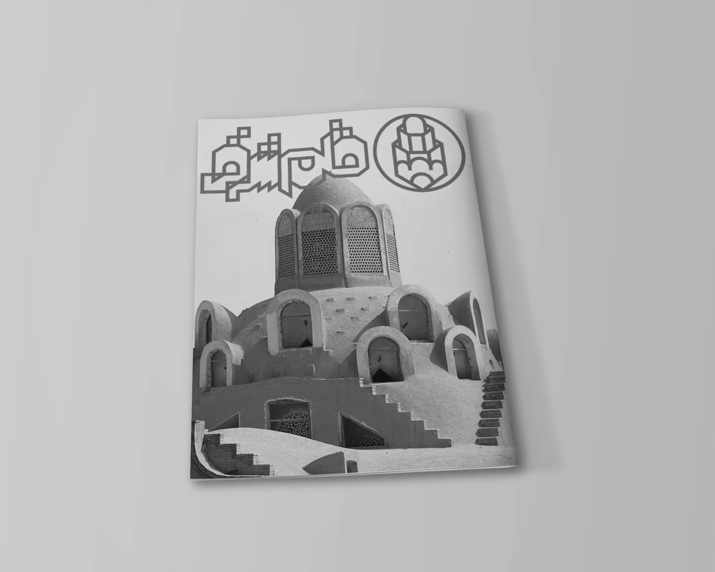
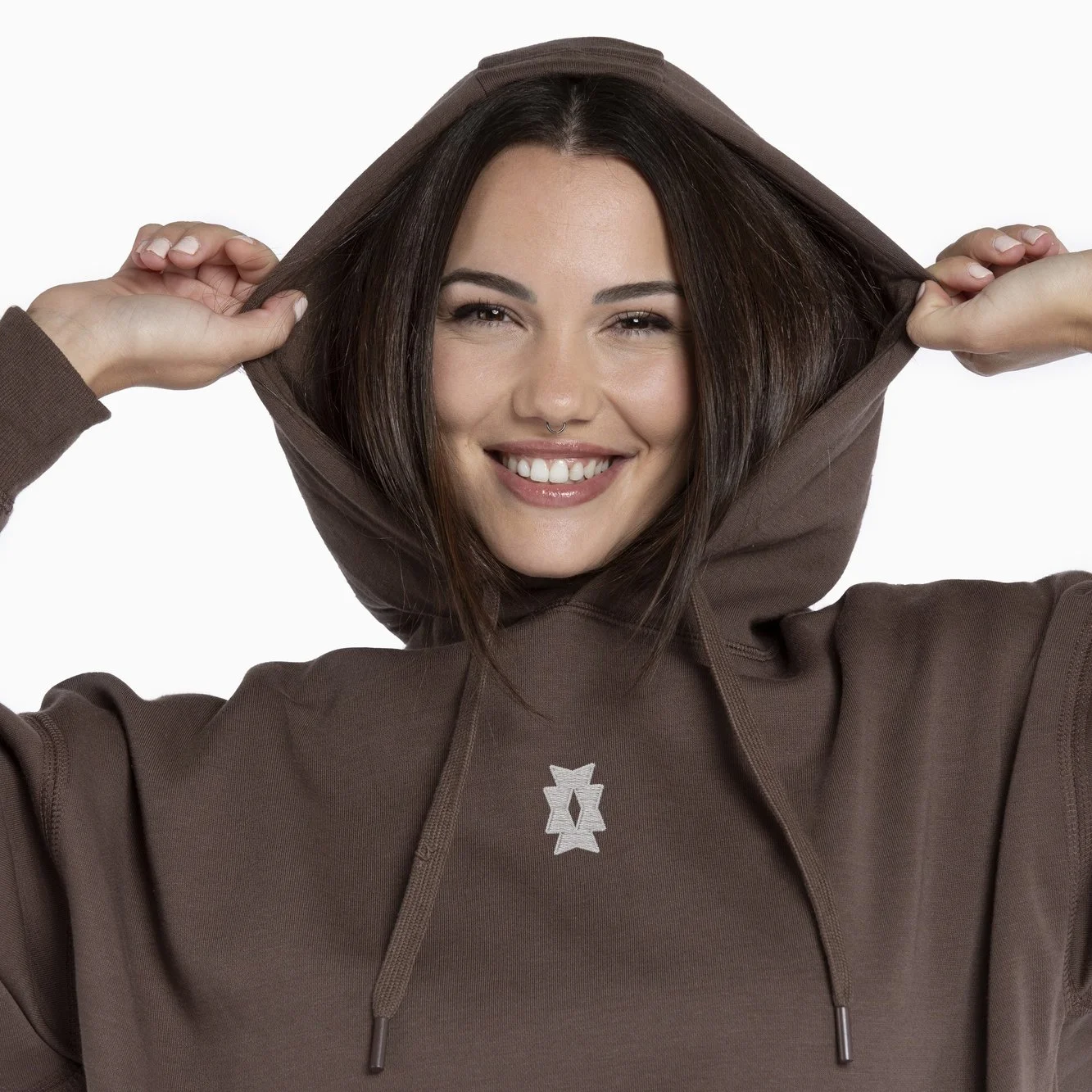
قلم شرقی
EASTERN PEN
A complete visual identity—logotype and symbol, created for a magazine dedicated to Persian and Middle Eastern architectural heritage, tracing the influence of ancient structures on contemporary design in Iran through a modern, geometric visual language
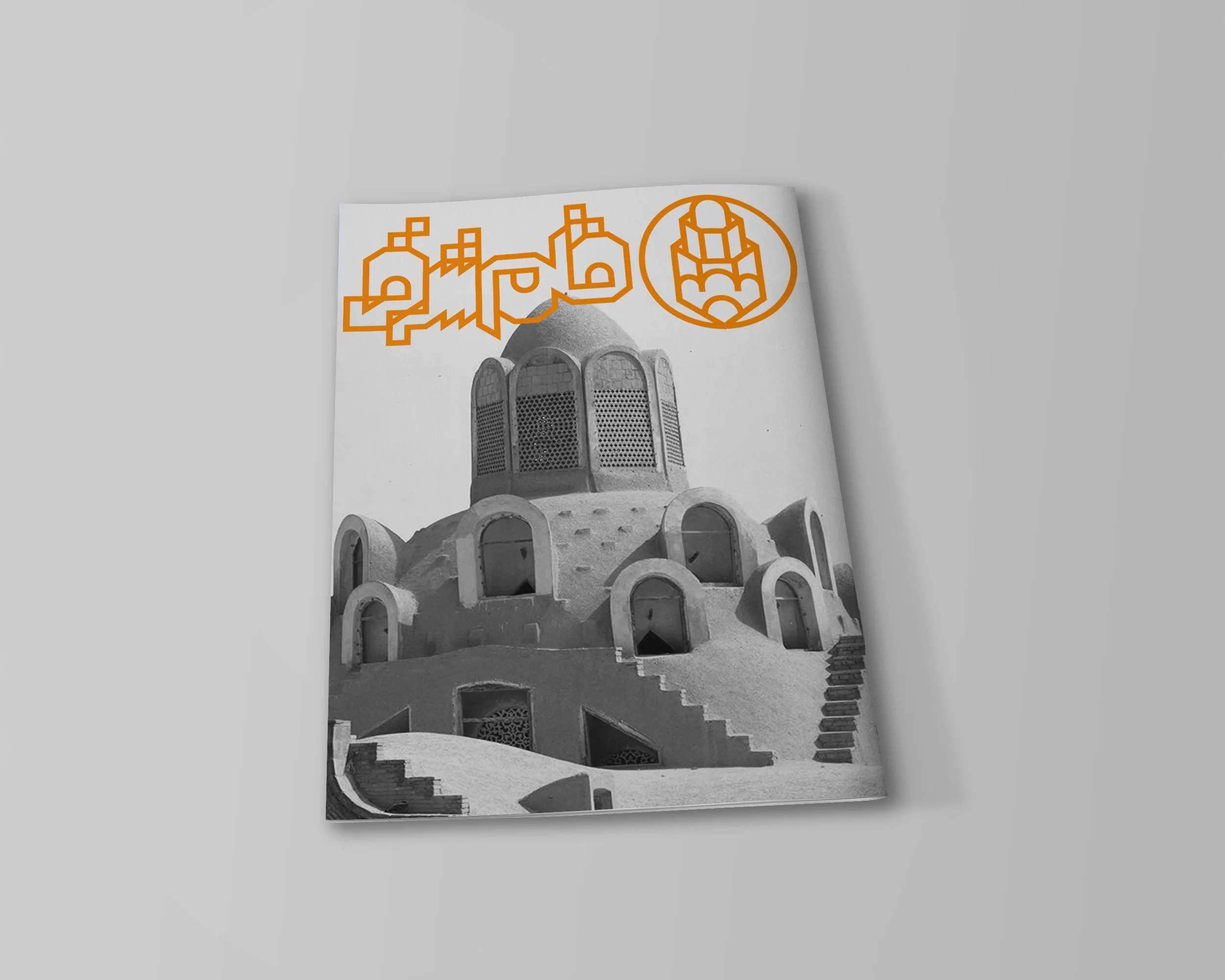
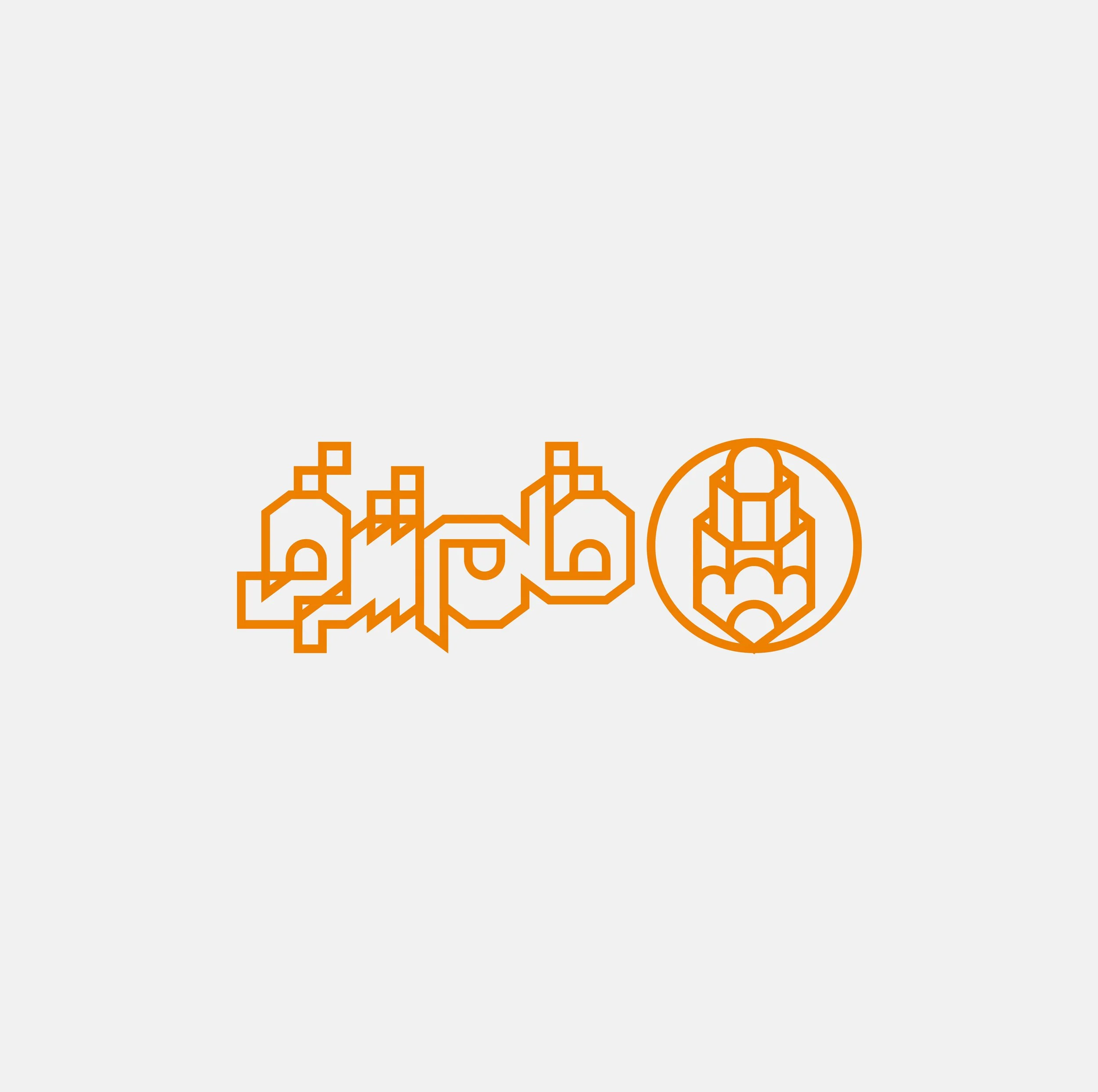
Client
Eastern Pen Magazine
Year
2021
LERO
A logotype and symbol developed for a research initiative centred on the study of light and the human eye, offering applicants a platform to investigate visual perception through a structured identity built around the concept of Light and Eye Research Opportunity.
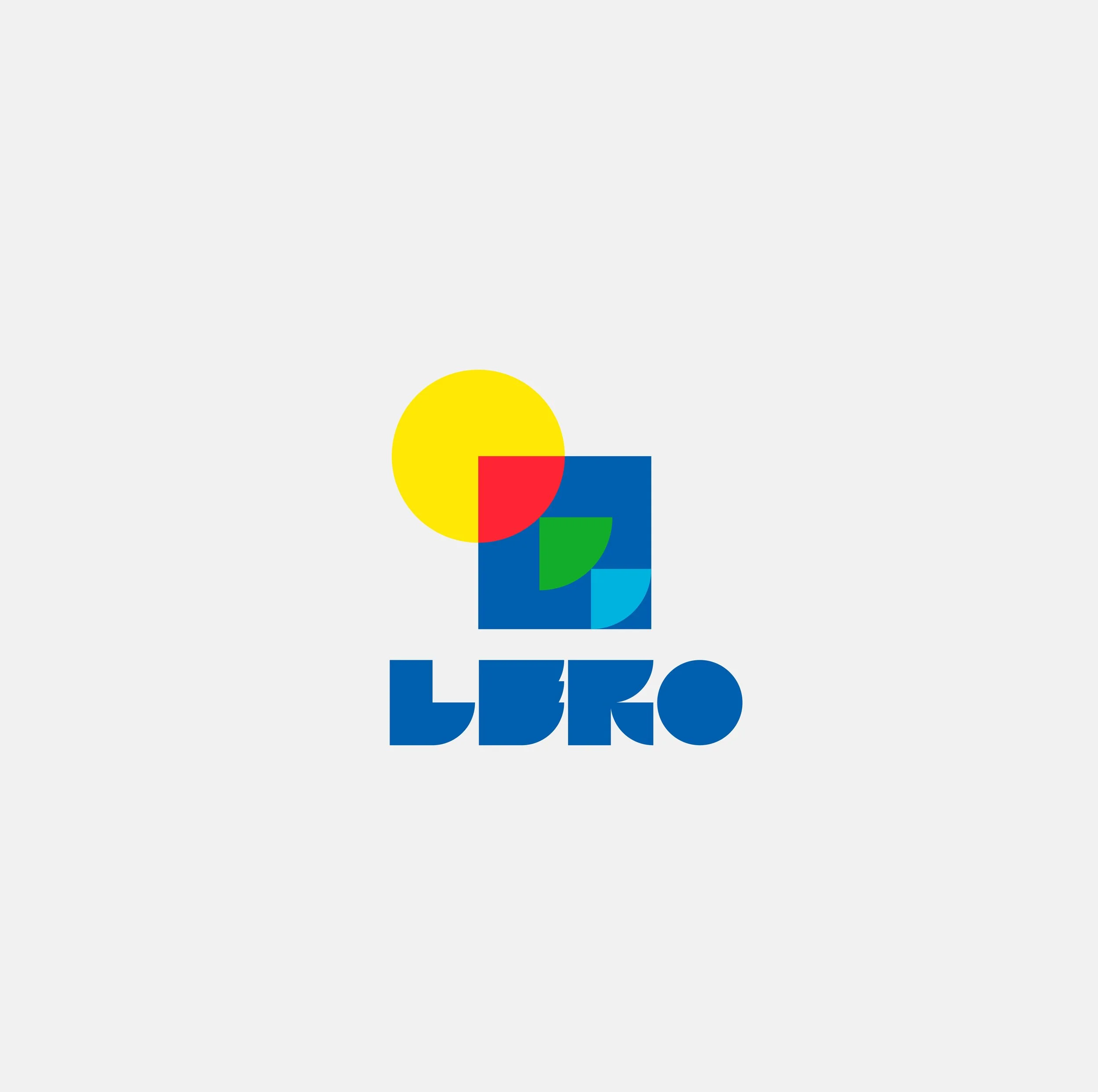
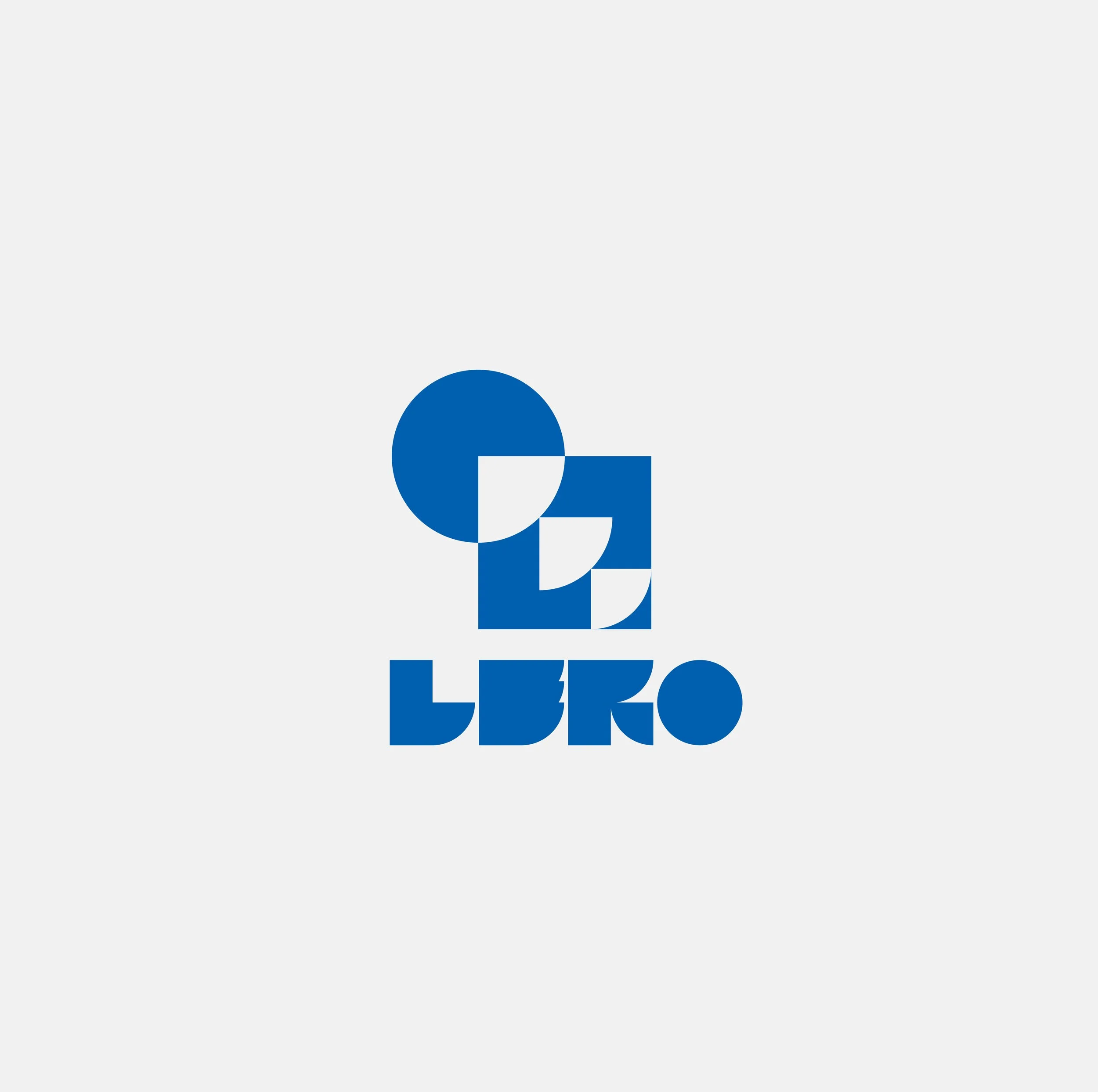
Client
LERO
Year
2021
کافه گالری کاوه
KAVEH Galley Cafe
A logotype and sign created for a gallery‑café that brings art into everyday space, offering visitors the chance to enjoy their coffee while exploring rotating exhibitions installed throughout the venue.
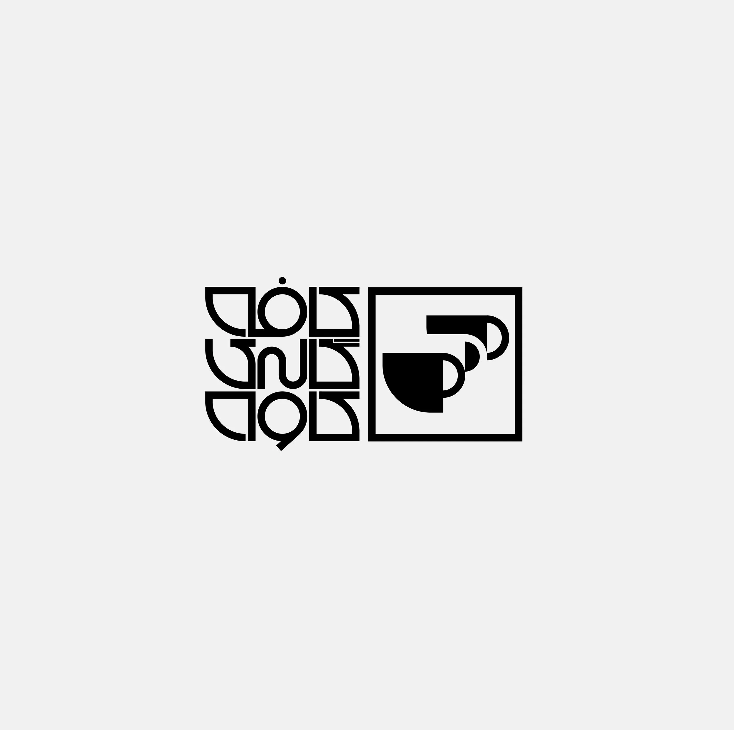
Client
KAVEH Gallery Cafe
Year
2019
MOGHANLO
مغانلو
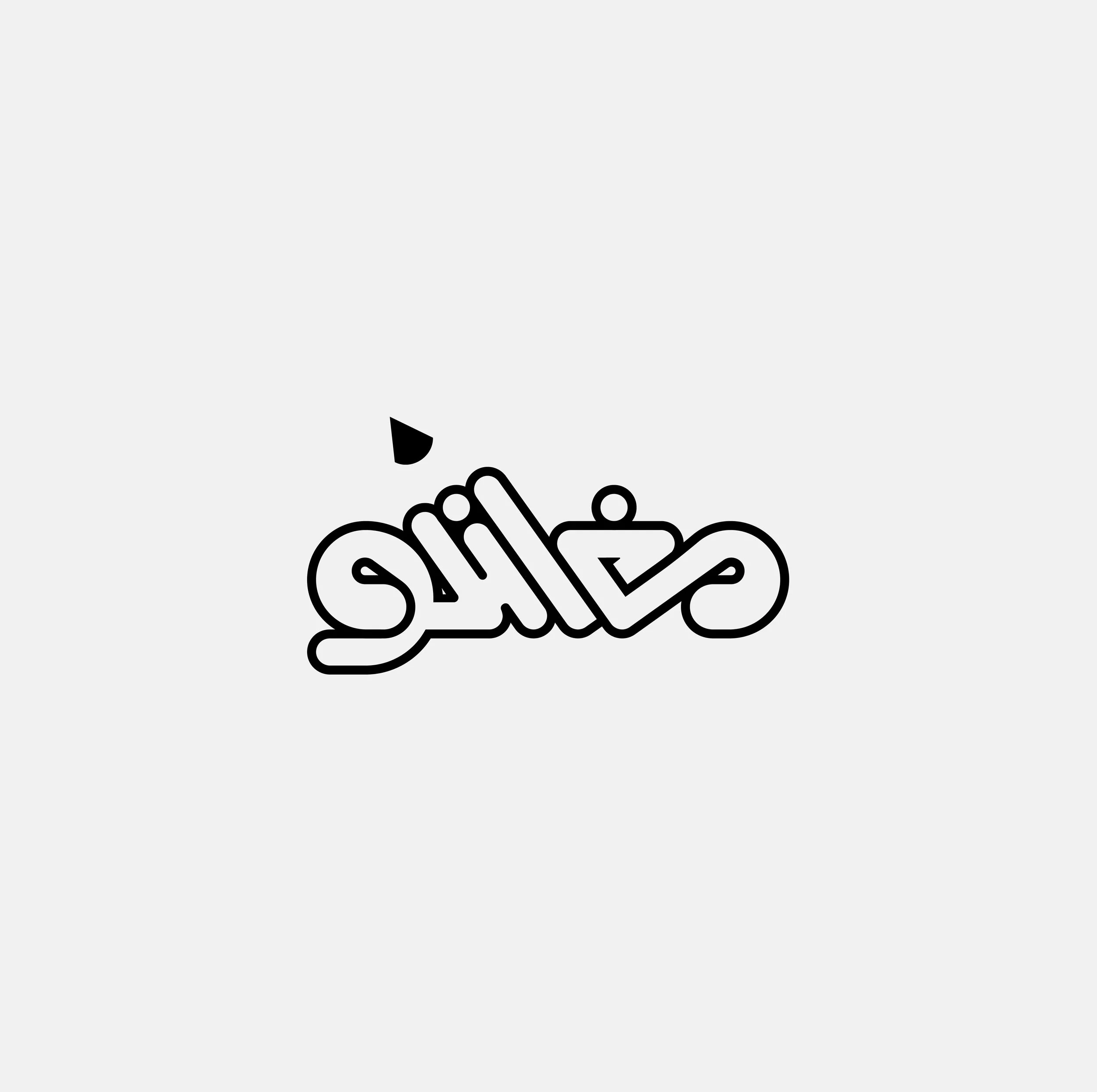
A logotype designed for a stationery store, built around smooth, rounded forms that reflect the accessibility, and everyday creativity at the heart of the brand.
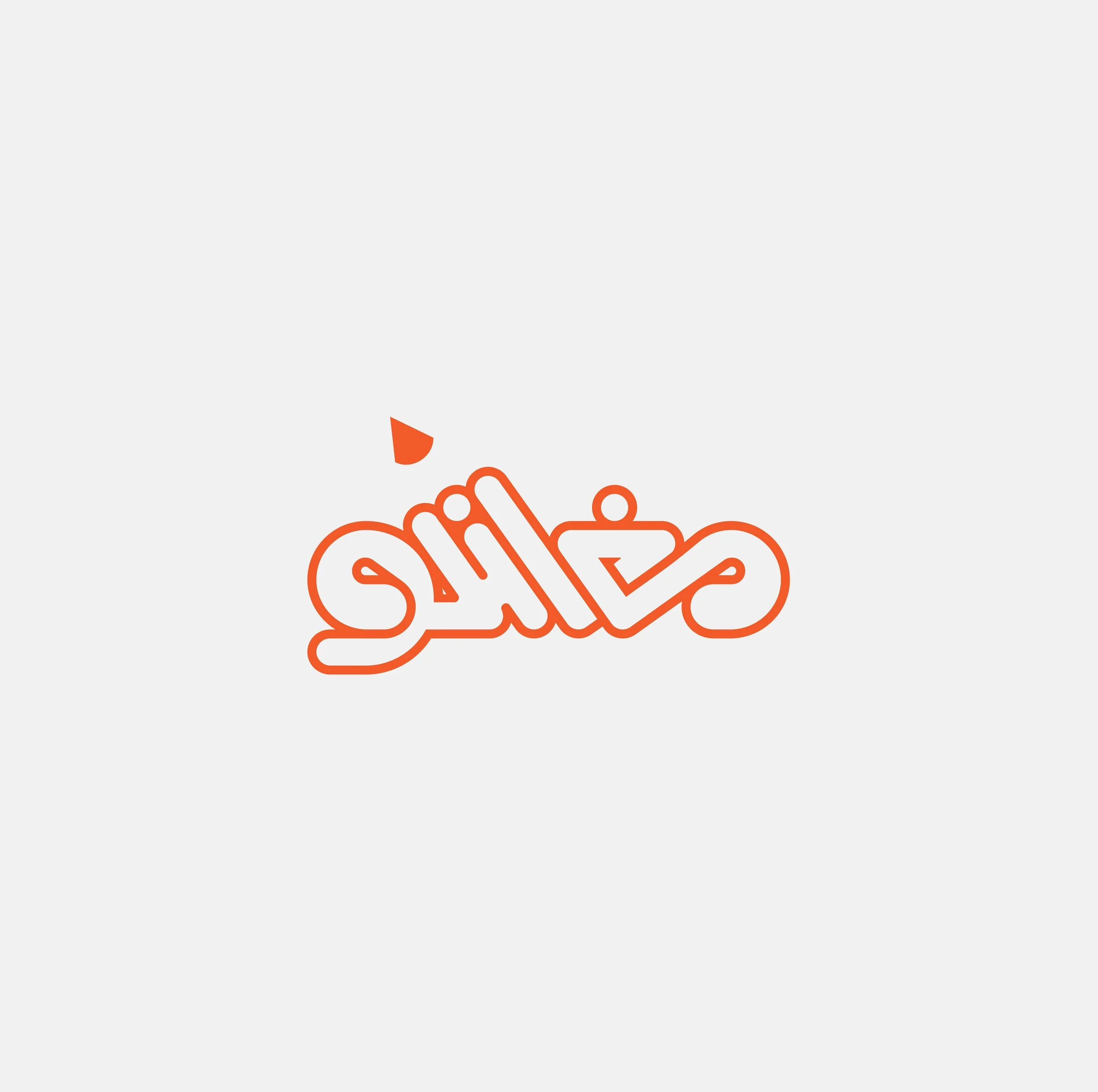
Client
Moghanlo
Year
2020
BROCK UNIVERSITY
A logotype designed for a campus T‑shirt competition, created to capture the energy and identity of the university through bold, expressive forms suited for wearable design.
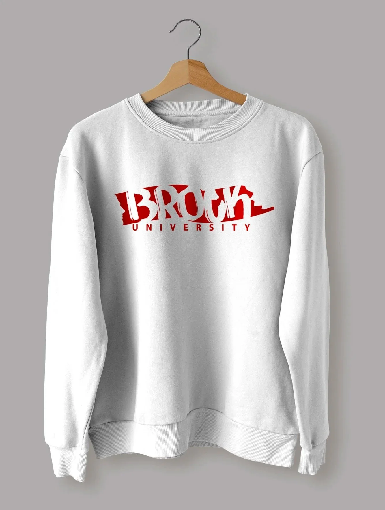
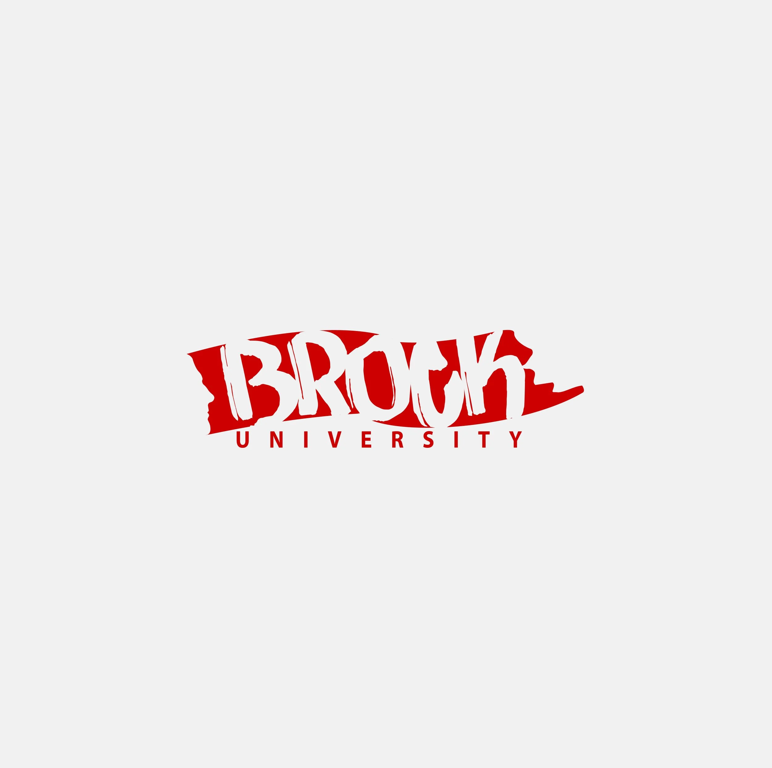
Client
Brock University
Year
2020-2021
NEZAREH
نظاره
A Persian logotype created for the second edition of an international festival in Iran, dedicated to discovering and supporting emerging artists across multiple media. The identity brings together tradition and contemporary expression, capturing the festival’s role as a platform for new creative talent.
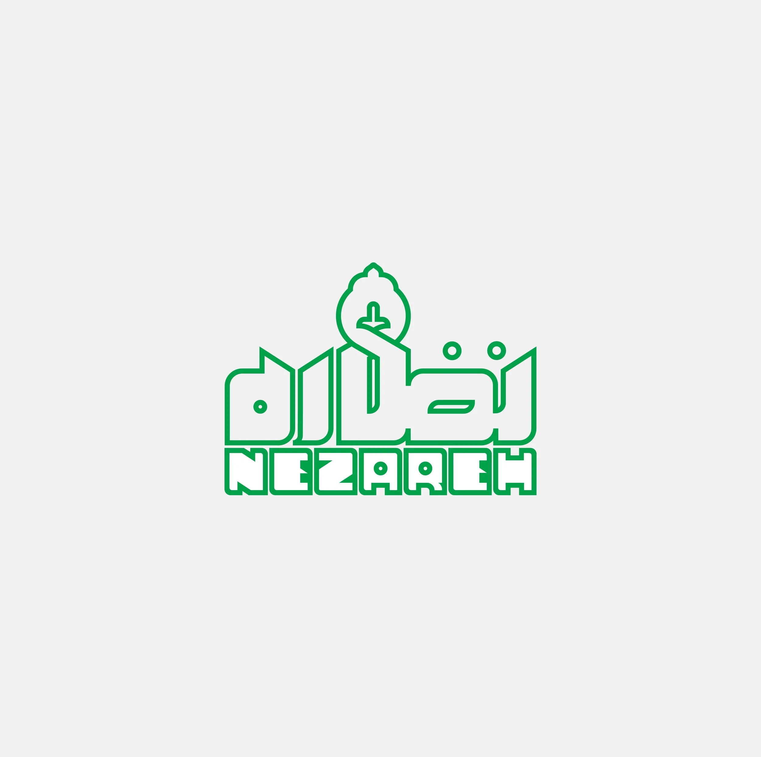
Client
Nezareh Festival
Year
2018-2019